.webp?width=760&height=395&name=Eva%20Bryn%20Shoetique%202%20(1).webp)
Just like people quickly decide if they like a stranger by the look of their clothes, when it comes to retail storefronts, first impressions also happen in seconds. The window displays are your brand's clothes. Those displays' visual impact on your potential shoppers determines whether they will walk in and shop or walk on by to a competitor.
Designing effective, engaging retail window displays is an underappreciated art that many stores get wrong. They become filled with chaotic merchandising or thoughtless placement that fails to connect with the passerby.
Without a clear purpose of why you put what you do in a window, nothing stands out to the shopper to want to know more. Even worse, the passerby says to themselves this isn't for me.
I'm sharing the elements that help a display captivate customers. You’ll learn the secrets of editing, color coordination, scaling, detail orientation, and what sets great retail windows apart.
Follow my guidelines and transform your storefronts from lackluster to traffic-stopping showpieces. With these failsafes for impressive visual merchandising, you can craft window displays that give your store the edge.
We held a holiday window contest, and from all of the submissions, these best show what success really looks like:
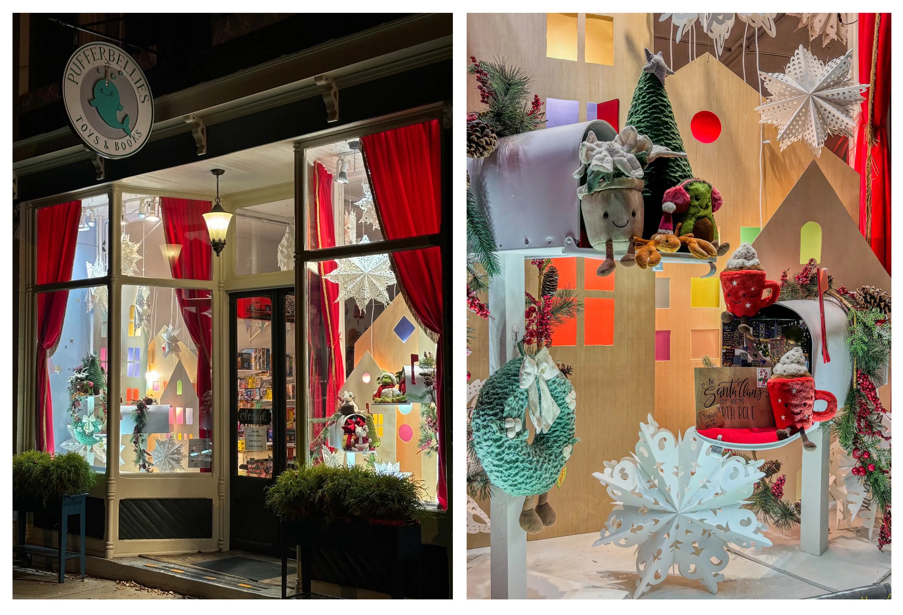
Pufferbellies Toys & Books, Staunton, VA
They always do a great job and make these windows in their spare time. I love that the attention to detail goes all the way to lining the mailbox lid with the letter to Santa. The snowflakes draw the eye down, the red curtains frame the view, and the focal point is clear.
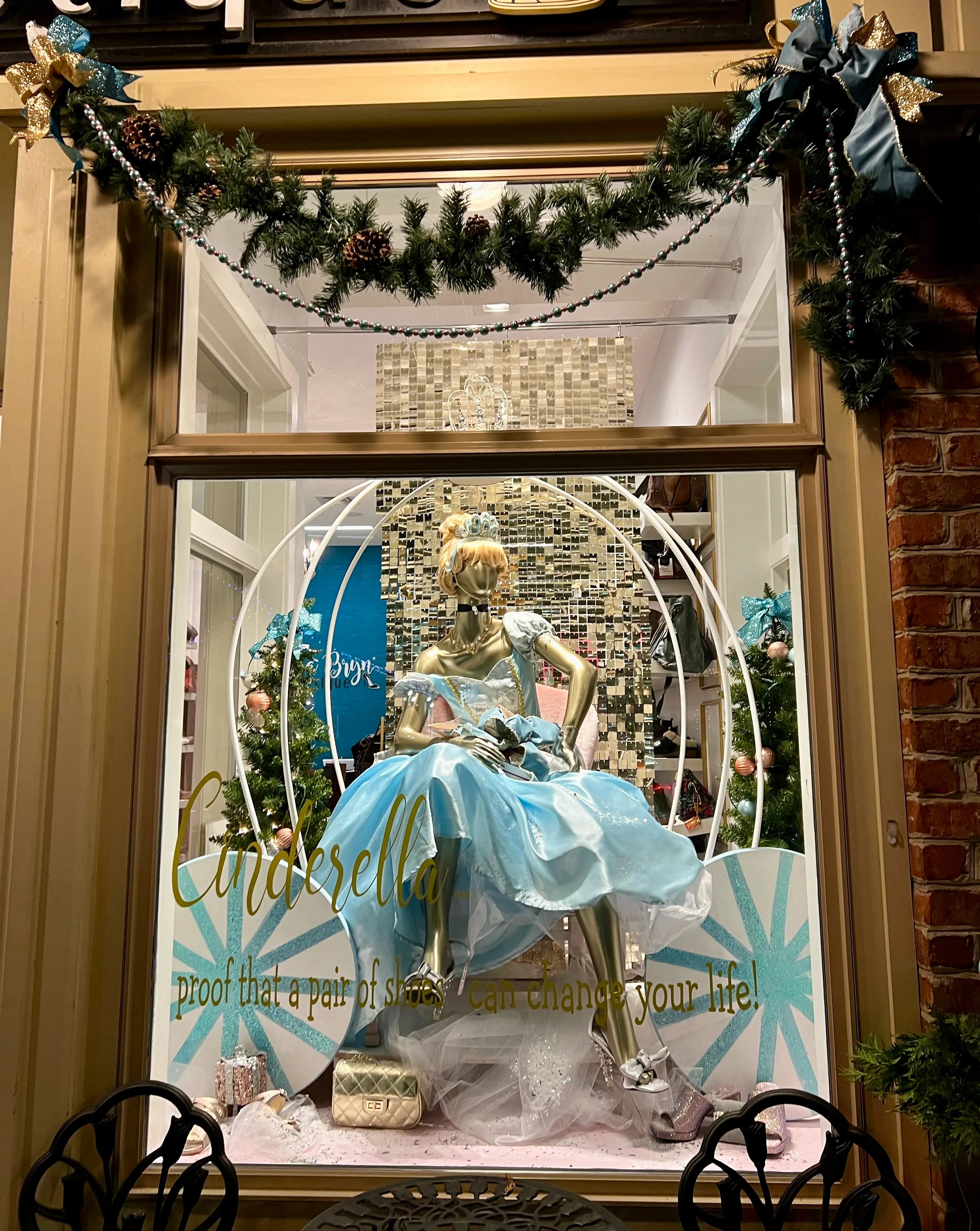
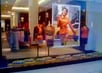
Eva Bryn Shoetique, Zelienople, PA
You can see the entire storefront pictured at the top. What I love about this is how the outside of the windows are decorated to draw the eye. The color-coordinated trees in the front and the tables and chairs to sit on make this Main Street location a winner.
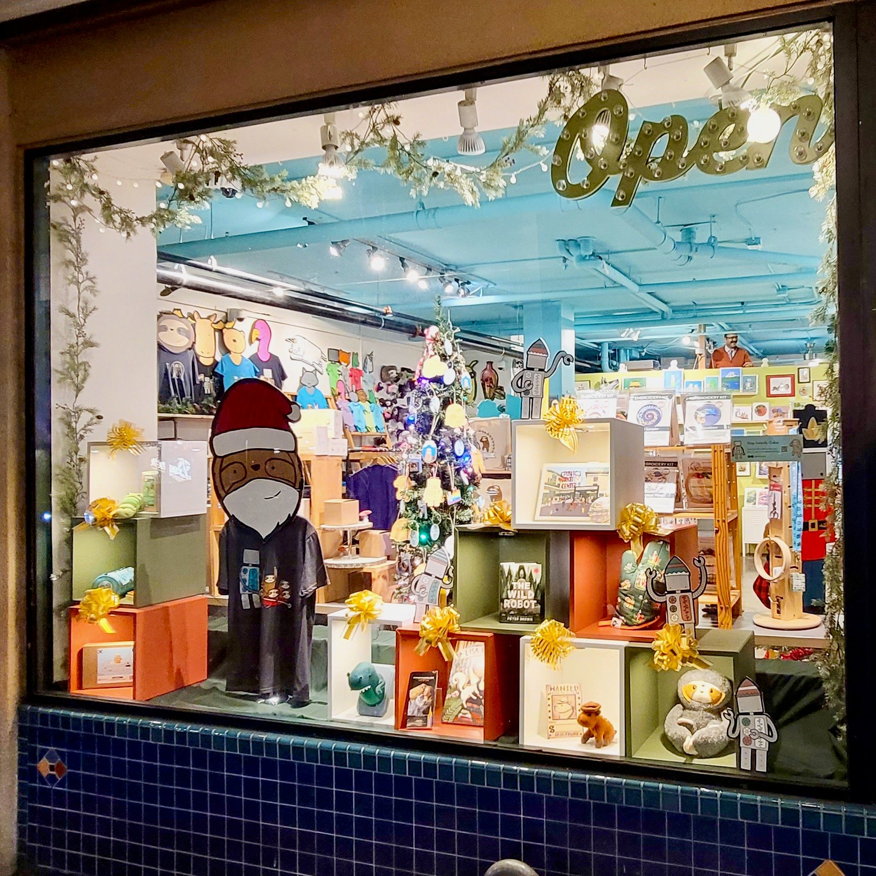
Robot Vs. Sloth, Seattle, WA
This outpost of creativity just up from the Pike's Place Market uses a few contrasting colors - actually, thirds of the color wheel, celery, tangerine, and lilac. The individual light in each box assures each product is fully spotlit. The back is left open so we can see in but still enjoy the window.
The Best Retail Window Displays Exhibit:
- Curation and editing. The displays that work well have an edited and curated assortment that brings focus and allows the eye to move around without being overwhelmed.
- A robust color scheme. Choosing two or three consistent colors to tie the display together works best.
- Preparedness and attention to detail. Great window displays are well prepared in advance, with deliberate details that create a sense of wonder. Well-done displays take a lot of time and effort.
- Scaling. They use the size or scale of the window and props appropriately rather than just filling the space.
- Respect for the viewer. The best displays respect the shopper's time, experience, and view by drawing them in and clearly showcasing the products and brand.
While stunning, effective retail window displays rely on mastering certain key elements, there are also several pitfalls to avoid when designing your storefronts.
Disorganization, a lack of product focus, discounting the customer experience – these types of shortcomings result in mediocre displays instead of great ones.
What to avoid? Here are the most common retail window faux pas and how to avert them. Keeping these design don’ts in mind alongside the keys to success we just covered will help you troubleshoot issues and prime your windows for appeal rather than failure.
Just as critical ingredients are in a winning recipe, missing the mark in a few areas can undermine the end result.
Read more about Visual Merchandising Here
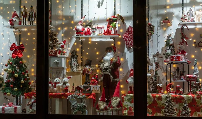
Look at the picture below - not a contest submission - as you read the missteps. To many people, this would be a great window, but look closer at how the elements compete with each other. Rather than a clear, focused presentation, we have a lot of red and white at multiple levels.
Common Missteps in Retail Window Displays:
- Clutter and lack of cohesion. When displays have too many messages, too many colors, or a mishmash of unconnected elements, they become difficult to interpret. That can include too many of the same things.
- Lack of product representation. If the products being sold are not shown clearly, the message and purpose of the window or display is unclear. Too many props or signs can stop the eye because there is no focus.
- Poor presentation. Displays that look carelessly thrown together show little regard for the viewing shopper. This can be anything from putting in as much as possible to unfinished decorations to unpinned mannequins that appear boxy.
- Covered windows. Blocking views into the store with temporary displays or decor is generally negative. It should invite entry rather than shut it out. Remember, people are first attracted to other people, then to merch.
- No attention to detail. It doesn't reflect a quality brand or positive retail experience when simple steps like accessorizing are lacking. Think just having a mixer in a display without a recipe book, mixing tools, and the finished product!
I can imagine people passing those top windows and saying out loud, "Wow." Whereas the one that's all red and white might be ignored as just a holiday window. That doesn't get them in the door!
The thought of transforming your lackluster or overwhelmed retail displays into stunning showpieces may seem daunting.
However, by applying the fundamentals I've outlined for visually captivating window designs alongside avoiding common pitfalls, any store can enhance its windows to engage more shoppers.
Start by objectively auditing your current displays and comparing them to the positive strategies and negative examples we covered. Identify any issues around the organization, such as color, scaling, product representation, or experience being offered.
Then begin implementing some impactful basics – edit and update with purposeful products and accessories, establish a coordinated color flow, and craft clever contrasts.
Focus on piquing curiosity while making the contents and brand identity clear from a distance. Follow these fundamentals to foster retail window flair and reboot your storefront’s curb appeal.
Building displays centered on great merchandising principles rather than just cramming in items will work magic on your foot traffic and sales.
I have an entire visual merchandising course inside SalesRX, my online retail sales training program. You can take a demo below.


.webp?width=102&height=111&name=IMG_1845%20(1).webp)