Updated May 23, 2024
Attracting customers as a primary objective can be a misnomer. Many retailers look to attract customers but don't consider what they really want - more purchases.
Accomplishing that ultimate objective takes more than just boosting a Facebook post or doing a live stream.
You have to capture the eyes before capturing the heart and, by extension, the wallet.
That's one reason I love this local Boston store, Miltons, which was recently covered in VMSD magazine. Why? Often, the fitting area for men is a dark cubby off the side of a bank of dimly lit stalls with dust balls in the corners and broken hangar parts on the floors.
Those retailers don't respect their male clients. Miltons does.
You must respect your customers and entice them. Visual merchandising goes beyond attractive displays; it's about crafting narratives that resonate with shoppers.
Building on our previous exploration of retail aesthetics and insights, and my longer post about the basics of Retail Merchandising, let's take a look at the nuances that guide customers through a store. You'll learn to notice the subtle dynamics and understand the strategies behind effective visual merchandising.
Utilize Empty Space Above Eye Level
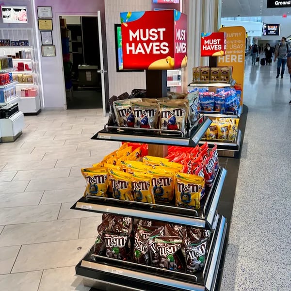
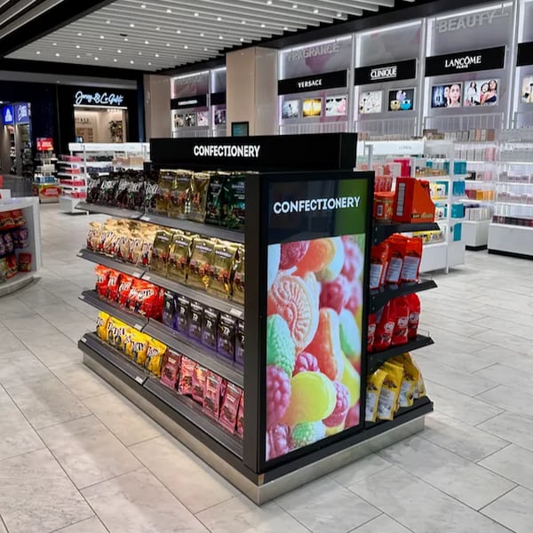
Often, hanging displays or banners above eye level can effectively utilize space and ensure the store doesn't appear cluttered. This fantastic display below, lit from top to bottom, shows a modern approach to grabbing eyes.
The red color at eye level says loudly, "Look here." The words make the brain wonder what it is missing (FOMO), and the well-lit displays featuring one well-known brand draw airport passersby into the shop—with M&Ms in hand.
Pathway Planning
Ensure a logical flow in your store layout. In North America, most people enter a shop and move to the right. That's why you place baskets by the door. You do this because once someone's hands are full, they aren't shopping anymore.
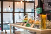
This store had beautiful graphics on the ends of its small, shoppable display fixtures. Although it used the brand colors, the displays didn't really pop.
Below, in the same store, a different location features one thing that effortlessly guides the customer from one section to another, increasing the likelihood of multiple purchases. Do you see it?
Yes, all displays are lit on the sides, the top, and the ends. These custom fixtures help cut down shoppers' choices, and they easily "get it." I hate going into a store to decipher what goes where, does what, for whom, etc.
The brain wants to see order to grasp the environment and how to move through it. When only you know the order, or you haven't planned the flow of traffic in your store, customers are more likely to move on rather than help you move product.
Themed Displays
Beyond holidays and seasons, consider topical or pop culture themes that resonate with your target audience. In the store below, the shark profile stands out from the top of the unit to draw your attention in to the shop.
This is an example of what I coined years ago, "a pig in the window." The simplicity of the item and the placement where you least expect it gains eyeballs.
Interactive Displays
Engage the shopper's sense of touch and interaction by creating displays where they can actively participate, such as touchscreens, try-before-you-buy setups, or DIY stations.
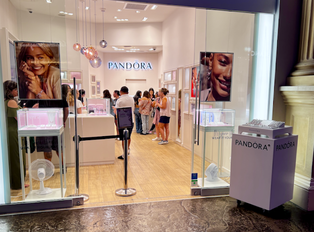
This Pandora in Las Vegas had a kiosk out front where you could try various rings before getting in the store. Note the traffic ;)
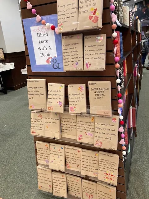
By wrapping various books, this bookstore makes you judge a book not by the cover but by what the reader associates wrote to intrigue you, which you must pick up to take a closer look.
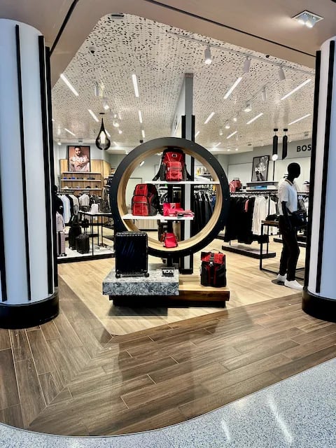
Employ a Focal Point
Each display should have a striking focal point to grab the shopper's attention immediately. This one does it with a black circle, white shelves, and red products. Once you have their attention, the eyes move down to the Tumi products.
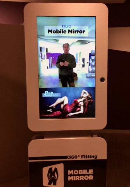
Use Mirrors
Small stores often have cubbies or areas that are away from the windows. Like in a house, a mirror reflects light into the space to make it more airy. Remember, shoppers are drawn to light and away from darkness.
Strategically placed mirrors can make spaces look larger and allow customers to envision themselves with a product (like trying on accessories). This mobile mirror placed on a wall bridged the gap between in-person trying on and virtual.
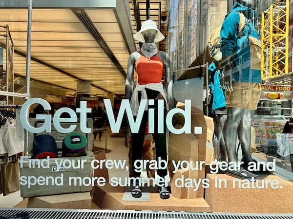
Consistent Branding
Ensure that the store's visual identity aligns with the brand's ethos. This helps in establishing trust and recognition among customers. Below is a window at North Face, New York City. The invitation to explore with friends is baked into their products.
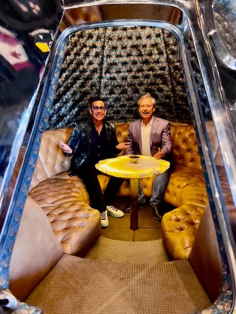
Below is a great example of smart wording on a display window. Timothy Oulton states they are one of Manhattan's most inspiring furniture stores. So, they have to do something to snap the mind a bit...
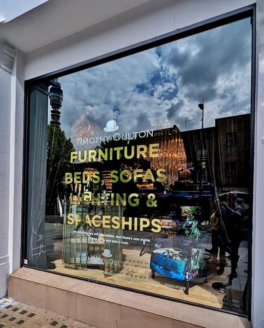
And they live up to their word, pictured here with my buddy Tony Drockton, CEO and Founder of Hammitt, inside their paisley upholstered spaceship.
Yes, the "Mini Apollo" is for sale, starting at just under twenty thousand dollars.
Educate Through Displays
Sometimes customers don't know they need a product or feature until they understand what they get out of it - its benefits. Add educational elements, like fun facts, usage tips, or short stories, to your displays.
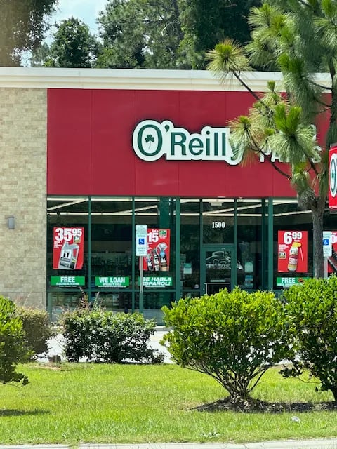
Think like a customer; you'll see short messaging like O'Reilly Auto Parts does on their window decals. They loan tools, they speak Spanish, and more. You don't need to wonder and ask inside...or worse, drive by because you don't think they do.
Creativity is so vital in signage
What not to do?
Have an Inconsistent Brand Message- When the displays aren't aligned with the brand's ethos and identity, it can confuse the shopper. Mismatched narratives - we're a premium store, and we are a discount store - can reduce the product's value and weaken the brand experience.
- Overloading shelves or display areas makes spaces look chaotic and can overwhelm shoppers. An overcrowded setup can make it hard for a product to stand out and may deter customers from exploring further because our minds are shut down with too many choices.
Lack of Adaptability
- Sticking to a single display layout for extended periods can result in visual monotony. Failing to rotate products, refresh themes, or adjust to changing shopper behaviors and seasons means missing opportunities to capture interest and encourage purchases.
And don't do this...
Claiming to be a luxury brand but using a holiday-style red table, unrelated products, and a discount sale sign doesn't match up.
It isn't hard to catch a shoppers' eyes when you use these tactics and lead them through your store. But it does take a level of understanding of color, of branding, and creativity.
Our visual merchandising course is part of my online retail sales training program, SalesRX.com.

.webp?width=102&height=111&name=IMG_1845%20(1).webp)